Extract Thumbnails instantly.
The ultimate tool for creators to analyze competition and optimize packaging. Built for speed and high-resolution quality.
“Shadowbans aren't really a thing on YouTube! Low views are usually a packaging issue. I'd focus on thumbnails and titles to boost CTR since that's the #1 signal YouTube uses to decide whether to push your content further.”
— vidIQ
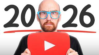
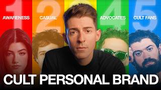
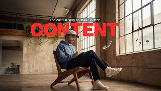
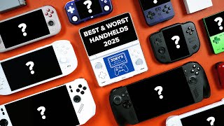
The 2026 Thumbnail Playbook
Analyzing the 11 styles currently dominating the platform. View Source
Neo-Minimalism
“A disruptive 'visual rest stop' in a loud feed. It stands out by being radically simple.”

- 50% negative space
- White/muted background
- High contrast
- Max 2 colors
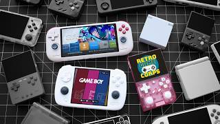
The Surround Style
“Captures attention with a center focal point, then keeps viewers exploring surrounding objects.”

- Main object dead center
- Circle or grid organization
- Recognizable products
Rainbow / Ranking
“Color spectrums signal completeness. Color gradients encourage engagement and debate.”
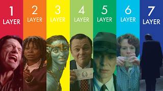
- 3, 5, or 7 topics
- Red-to-blue gradient
- Hierarchical numbering
Whiteboards
“Signals educational value and authenticity. Cuts through AI generation with a 'human' feel.”
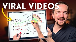
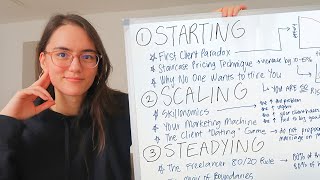
- Hand-drawn diagrams
- Framework focus
- Curiosity gaps
Interface Mimicry
“Borrows credibility from established platforms like Twitter, iOS, or Amazon.”
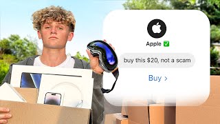


- Exact UI matching
- Verification checkmarks
- Blunt text
Cinematic Text
“Associates content with Netflix-quality production. Feels like a still from a movie.”
- 3-4 words embedded in light
- Negative space focus
- High contrast
Warped Faces
“Unsettling pattern interrupts create a split-second curiosity gap that forces a click.”
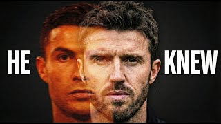
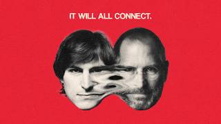
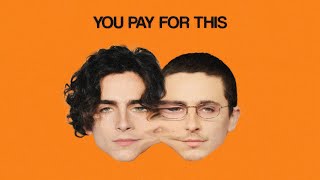
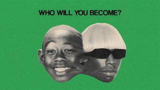
- Double exposure
- Merged faces
- Minimal text
Maximalist Flex
“Appeals to the brain's love for collecting and organizing. Establishes visual credibility.”
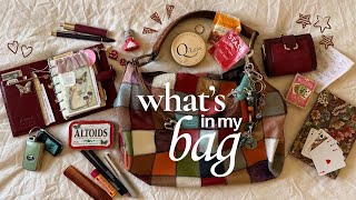

- Item is the star
- Cleanly arranged items
- Controlled chaos
The Grid Aesthetic
“Signal that the creator has organized a complex topic into an easily digestible format.”
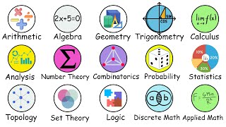
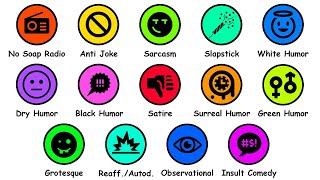
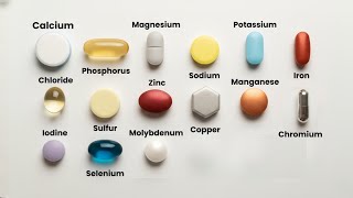
- Flat illustrations
- Neutral background
- High-contrast icons
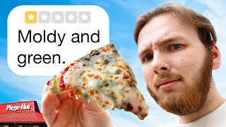
Candid Fakes
“Moves away from hyper-saturated styles toward believable, authentic-looking fiction.”


- No text/arrows
- Perfectly engineered frame
- Authentic restaints
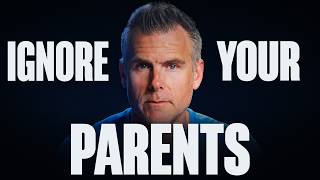
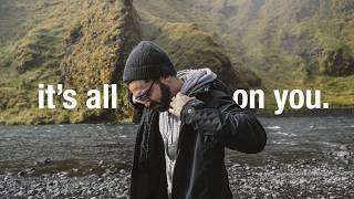
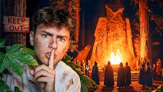
The Anti-Thumbnail
“Stands out in a bright feed. Removes risk by asking for a specific, small commitment.”
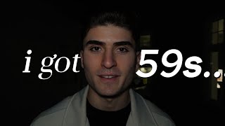
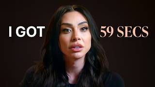
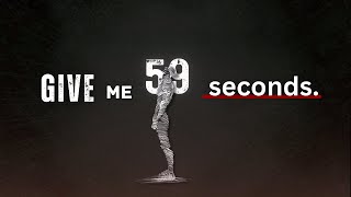

- Serious/Quiet image
- Oddly specific time constraint
- Direct eye contact
Rules to Follow
- 01.Context Matters: Test how it looks in the chaos of a feed, not just on your screen.
- 02.Less is More: Cut complexity in half. Limit text to 3-4 words max.
- 03.Practice Niche Bending: Borrow successful formats from other niches and adapt them.
- 04.Understand Shelf Life: Trends work because they are disruptive. Watch for burnout.
"Thumbnails usually don't win just because they are pretty; they win because they introduce a fresh pattern. The era of red arrows and circles is dying out."